Data Visualisations and Infographics
Communicating complex data clearly across research and learning contexts
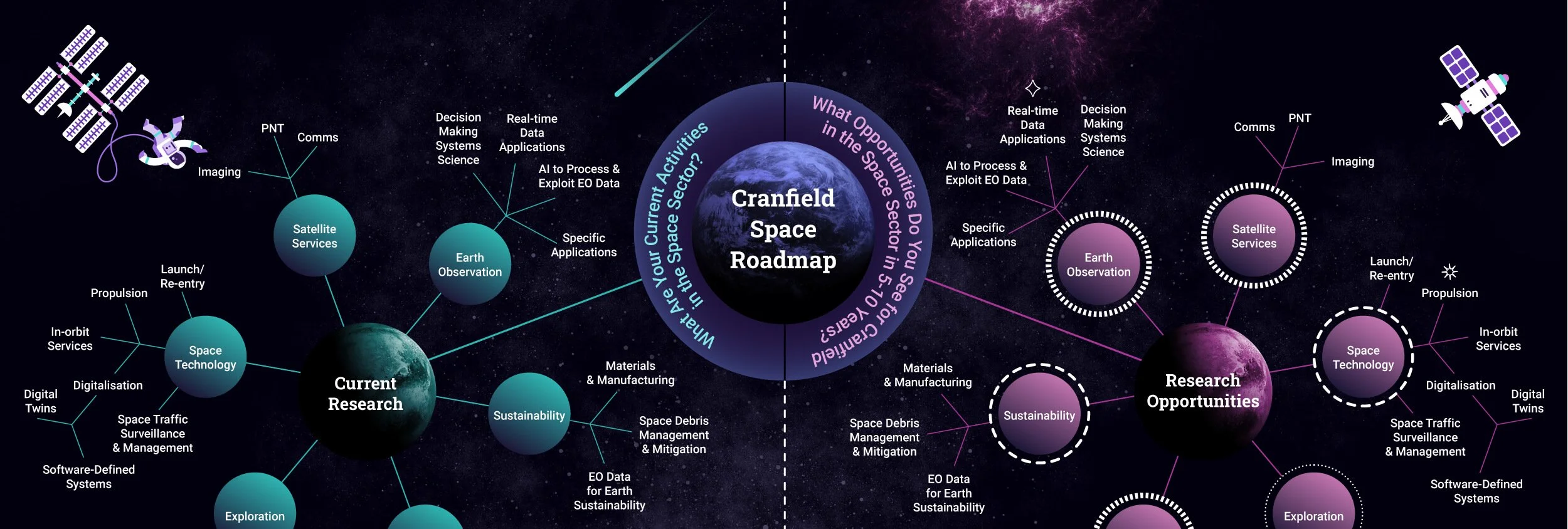
Produced a selected body of data visualisation and infographic work for e-learning, higher education, research communication, specialist training, and presentations. This includes charts, diagrams, comparative graphics, process visualisations, and explanatory infographics designed to support specific learning or communication goals.
Source material comes from spreadsheets, research reports, structured interviews, and subject-matter expert input. Each visual translates fragmented or abstract information into a clear structure, supporting understanding where tables or text are insufficient.
Data visualisation is treated as an analytical and explanatory process, not a decorative one. Work begins by identifying what the audience must understand, then deciding on data selection, hierarchy, scale, and visual form. Both quantitative and qualitative data are handled with equal rigour, including the synthesis of narrative or interview-based material into coherent visual frameworks.
The resulting visualisations reveal patterns, relationships, and comparisons that support learning, decision-making, and research communication. Used across digital platforms, print, presentations, and exhibitions, they reduce cognitive load and enable confident engagement with complex data.
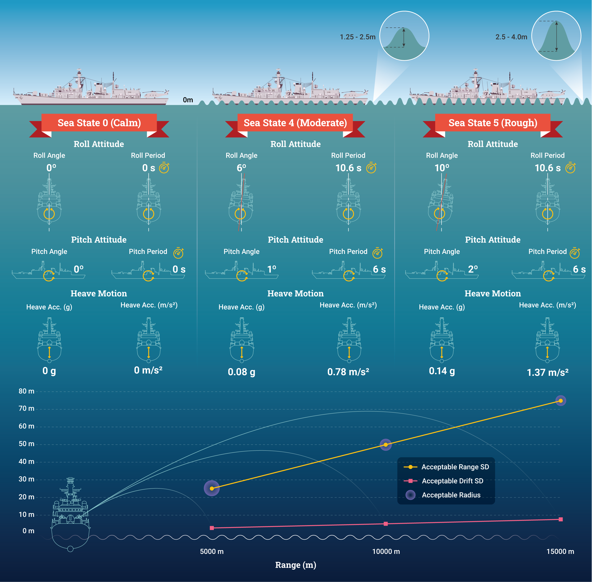
Image description.
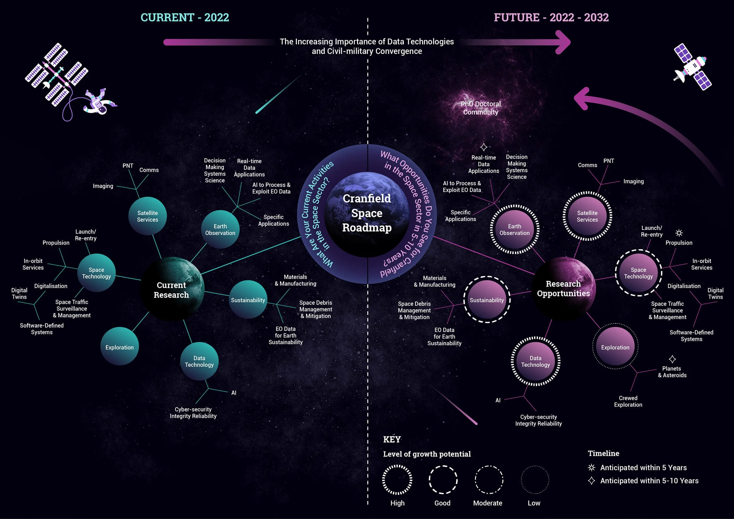
Image description.
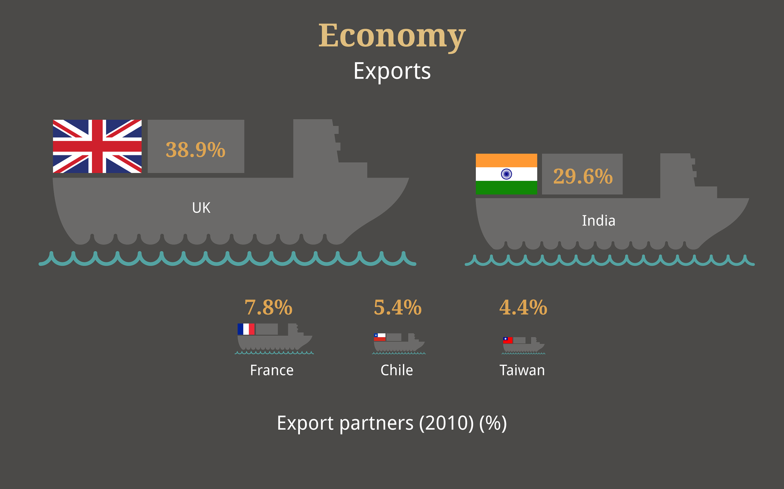
Image description.
Image description.
Image description.
Image description.
Image description.
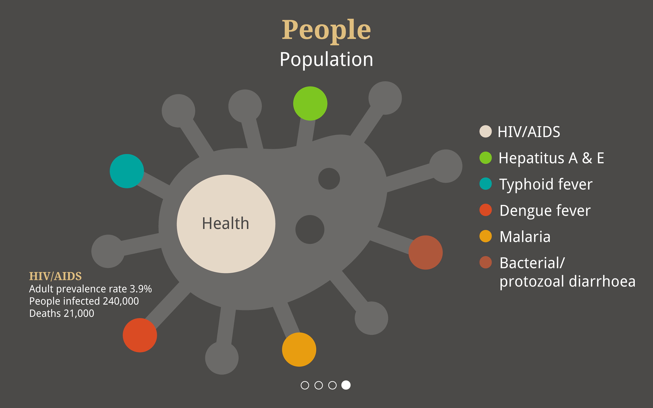
Image description.